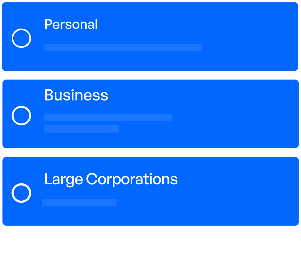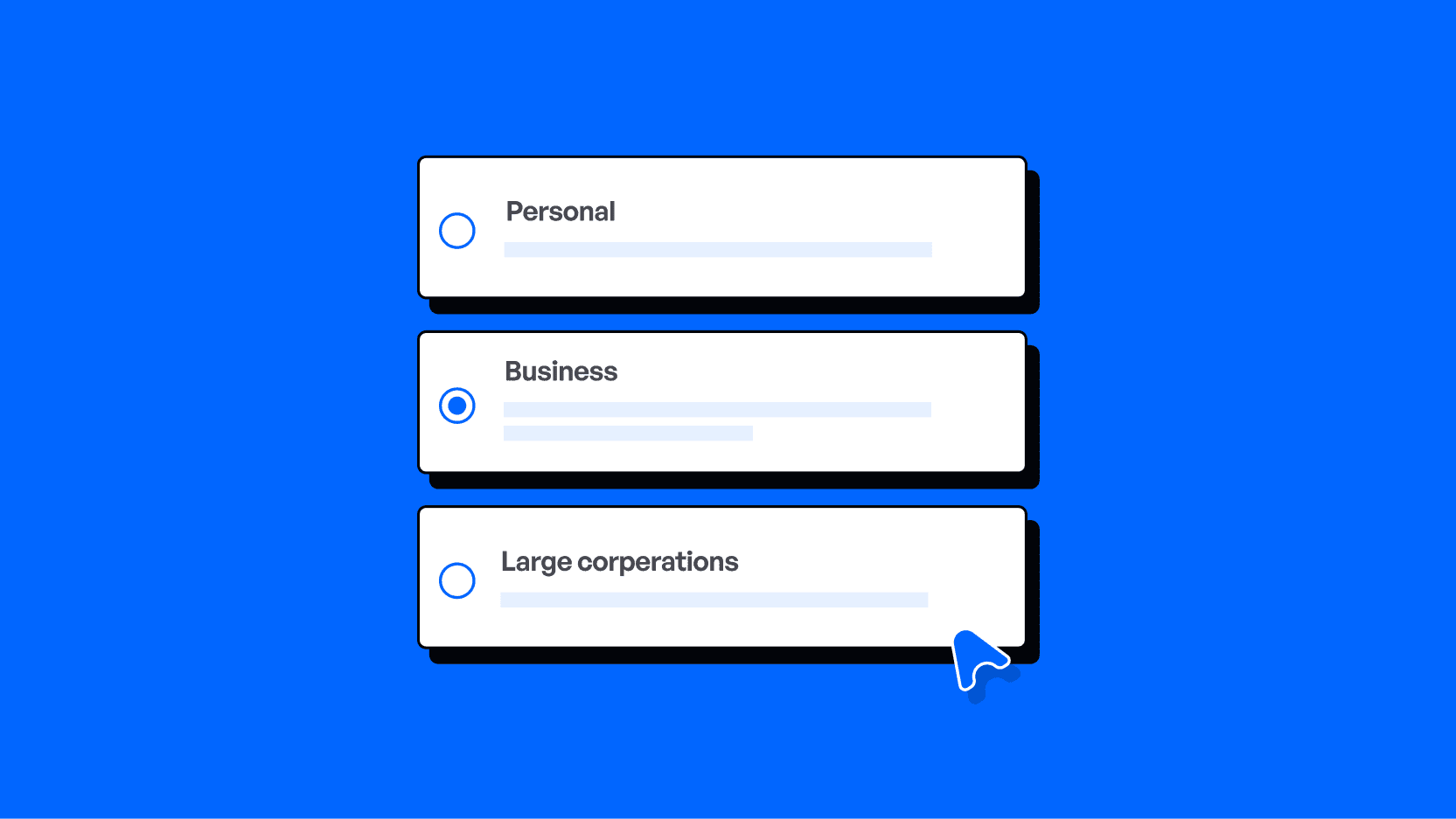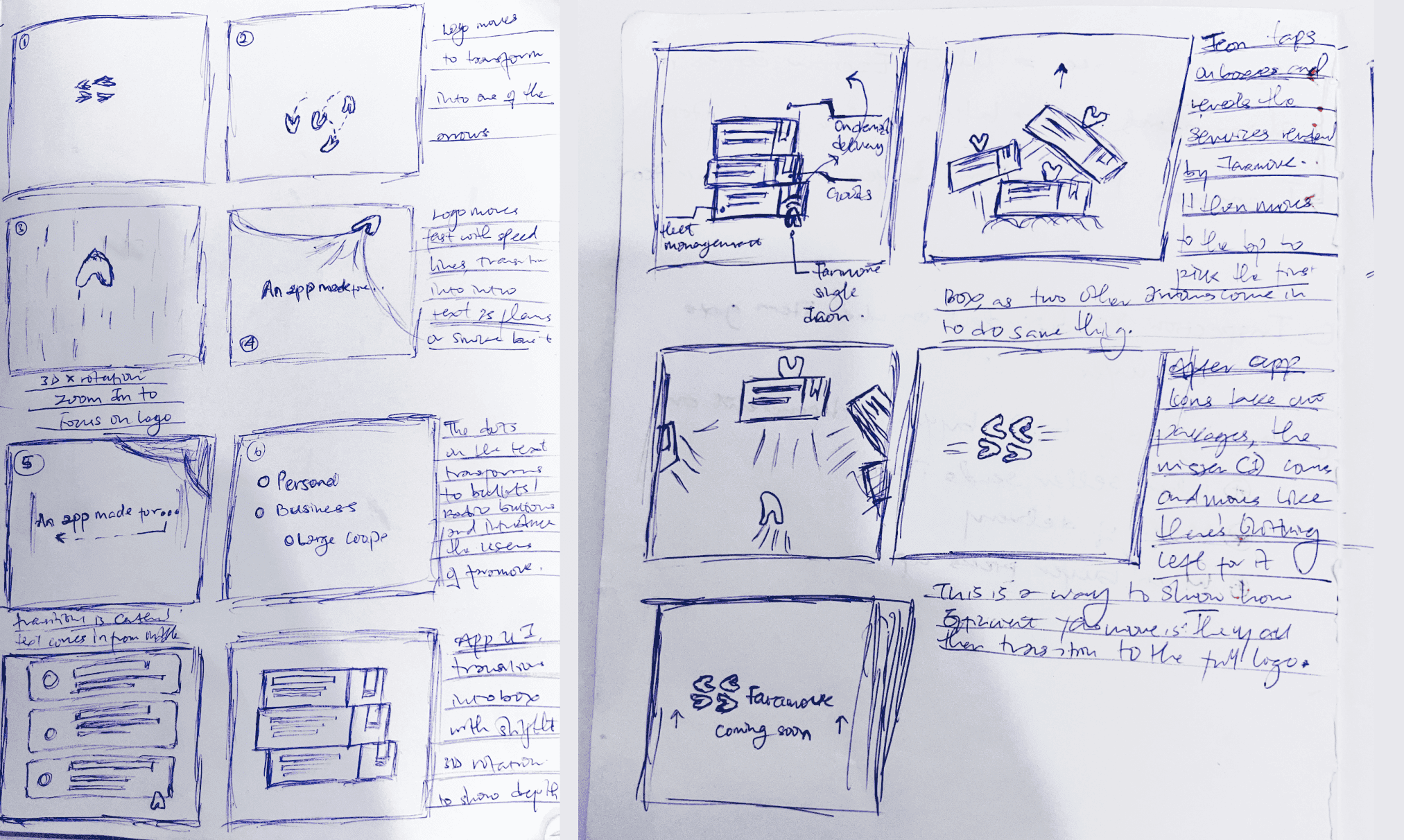
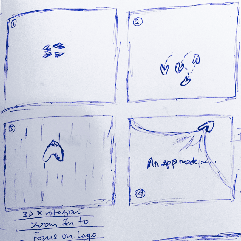
What we needed to highlight were the three features that set Faramove apart. While this would normally feel like an incomplete - or even nonexistent—brief, it turned out to be an exciting moment: I realized I had full creative control.
FARAMOVE
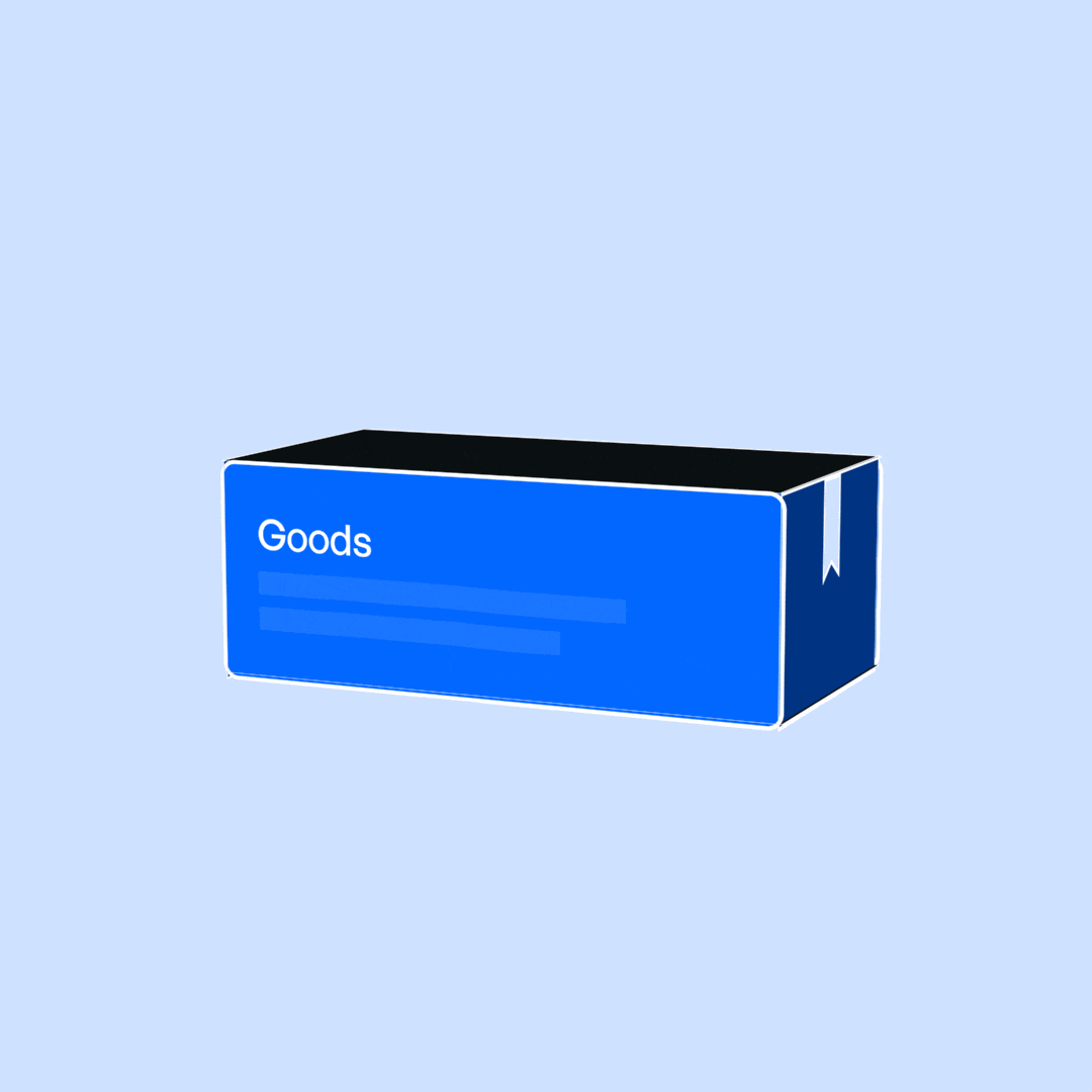
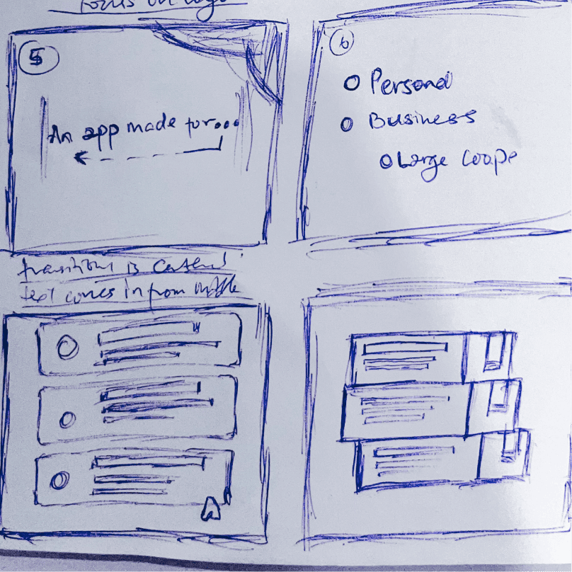
When home delivery became a necessity after COVID-19, Faramove wanted to reassure customers that a smarter solution was coming. I crafted a teaser video that introduced the mobile app and built anticipation for its launch.
 STY-1
STY-1  STY-2
STY-2  STY-3
STY-3  STY-4
STY-4  STY-5
STY-5  STY-6
STY-6  STY-7
STY-7  STY-8
STY-8  STY-9
STY-9  STY-10
  STY-11
  STY-12
  STY-13
  STY-14
  STY-15
  STY-16
  STY-17
  STY-18
  STY-19
  STY-20
  STY-21
  STY-22
  STY-23