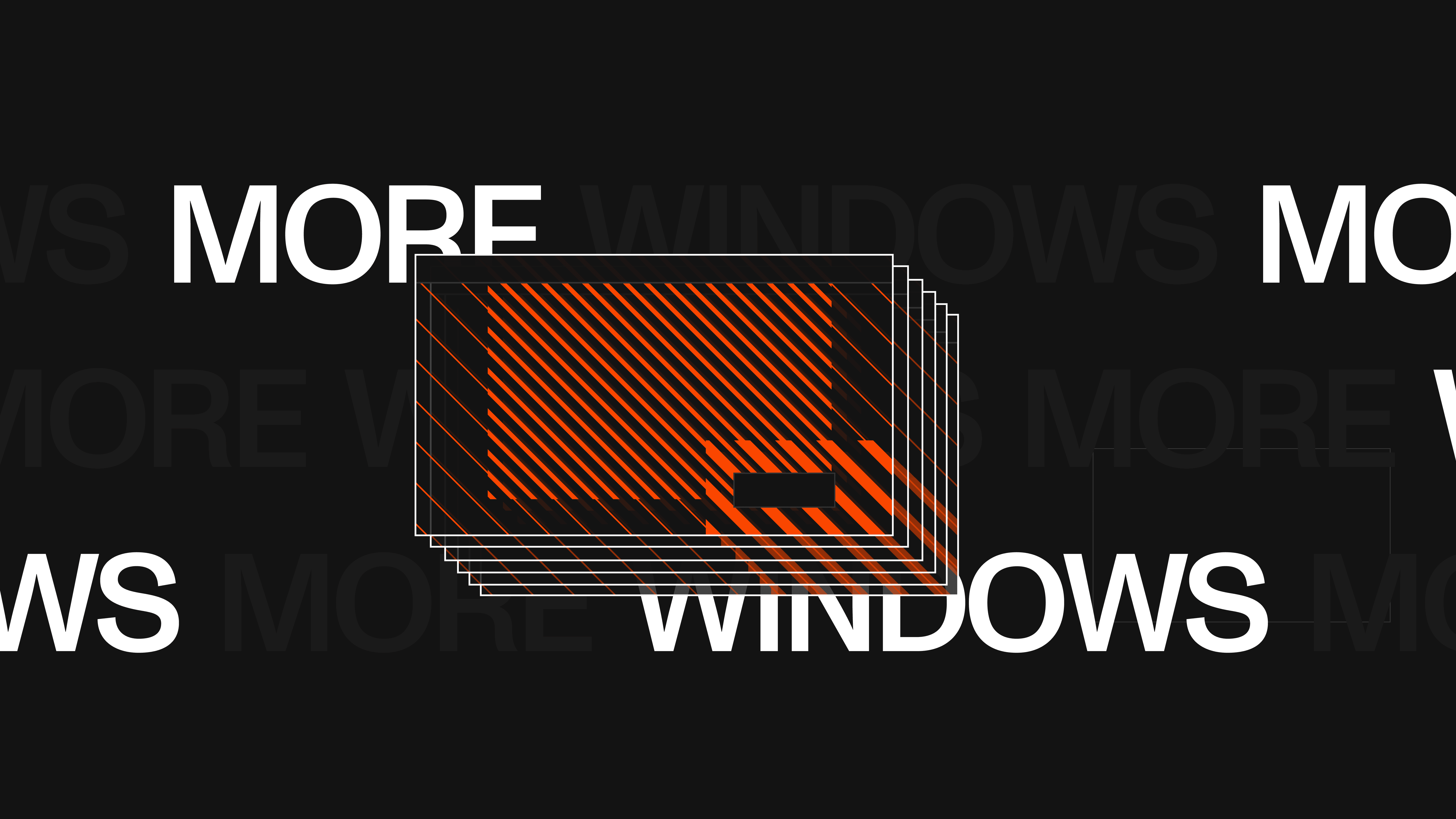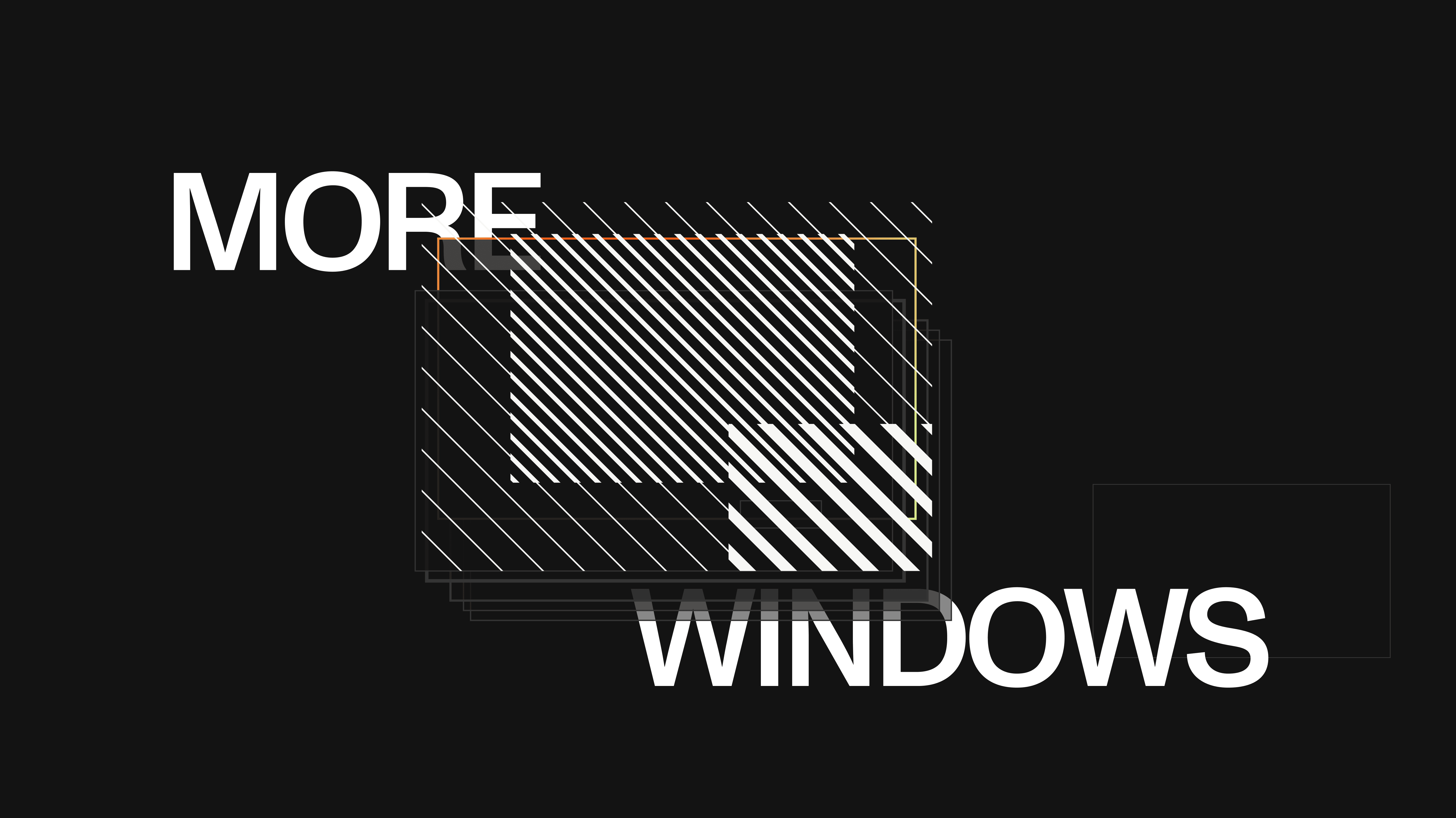
As the launch date got closer, not skipping the usual sketching and writing process would have only slowed things down. With a brand that already had a strong visual identity, the best way to begin was through focused research, gathering references and designing a few test frames to set the direction quickly.
OPSIN
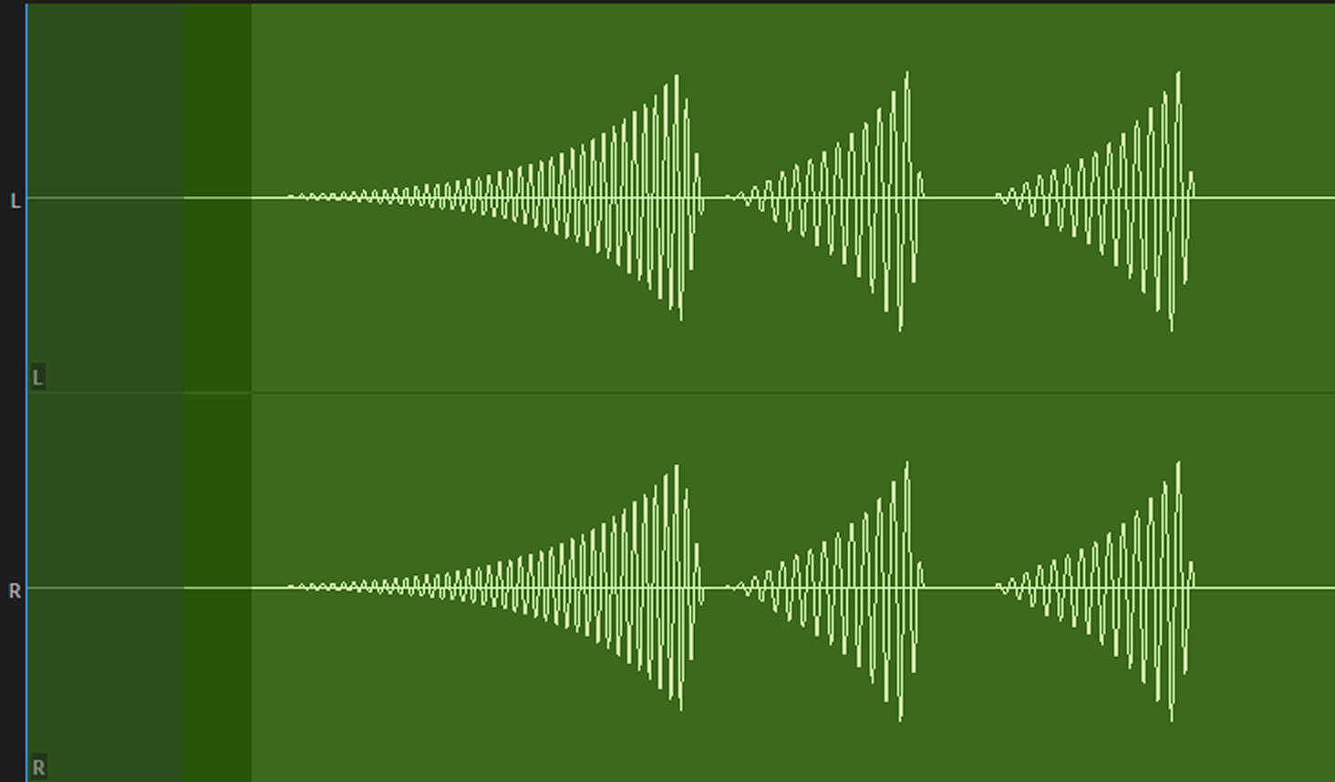
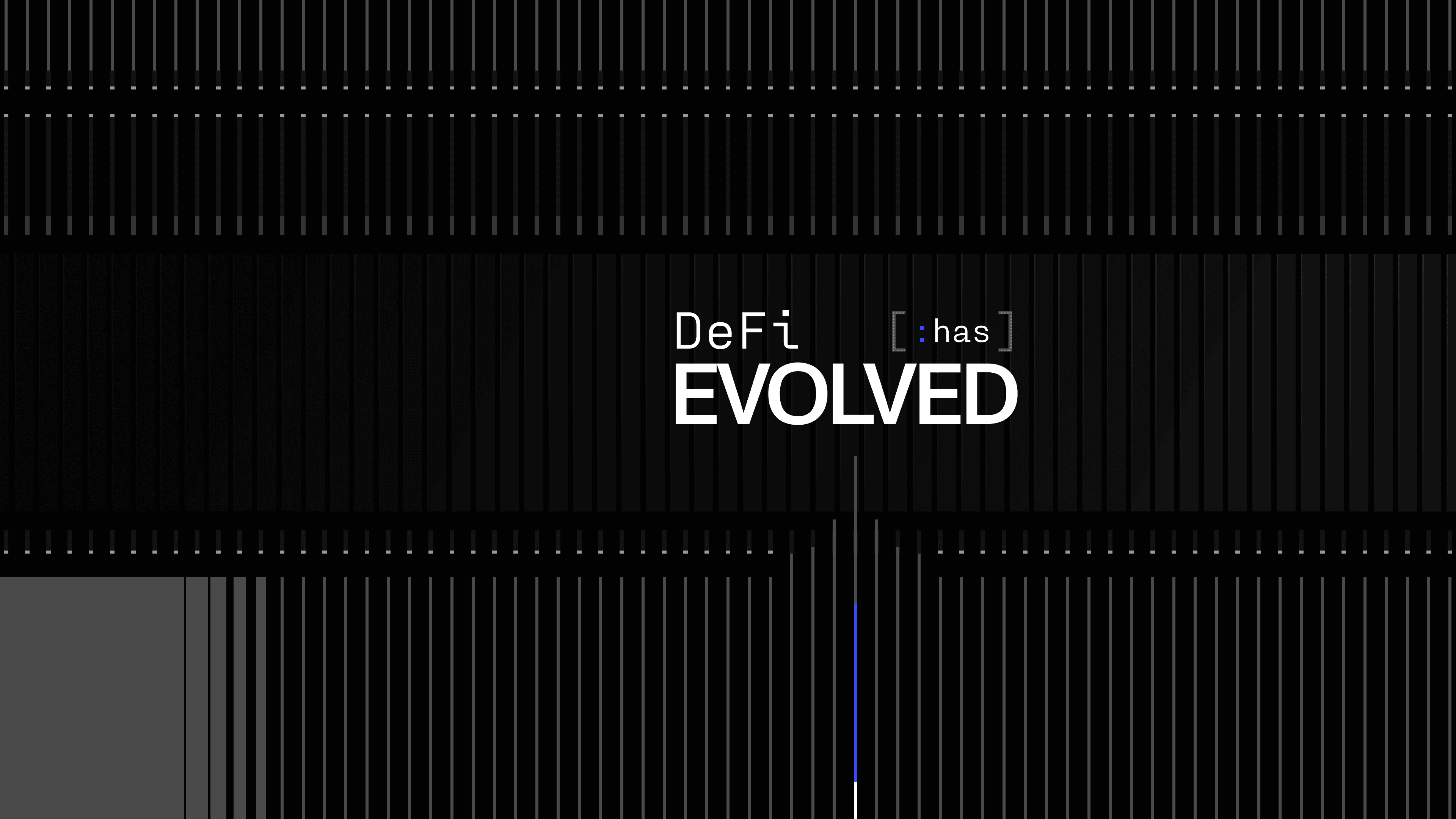
To introduce a next-generation crypto terminal - I crafted a teaser video that sparked excitement around its launch, blending energy for the crypto-native crowd with clarity for everyone else.
 STY-1
STY-1 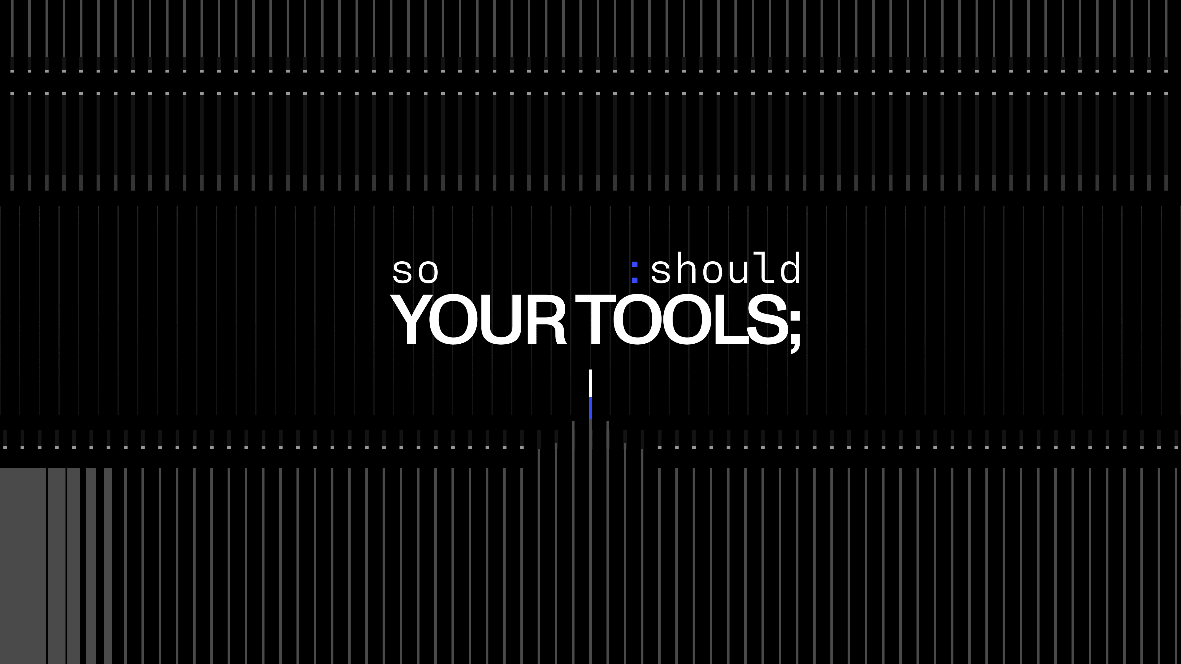 STY-2
STY-2 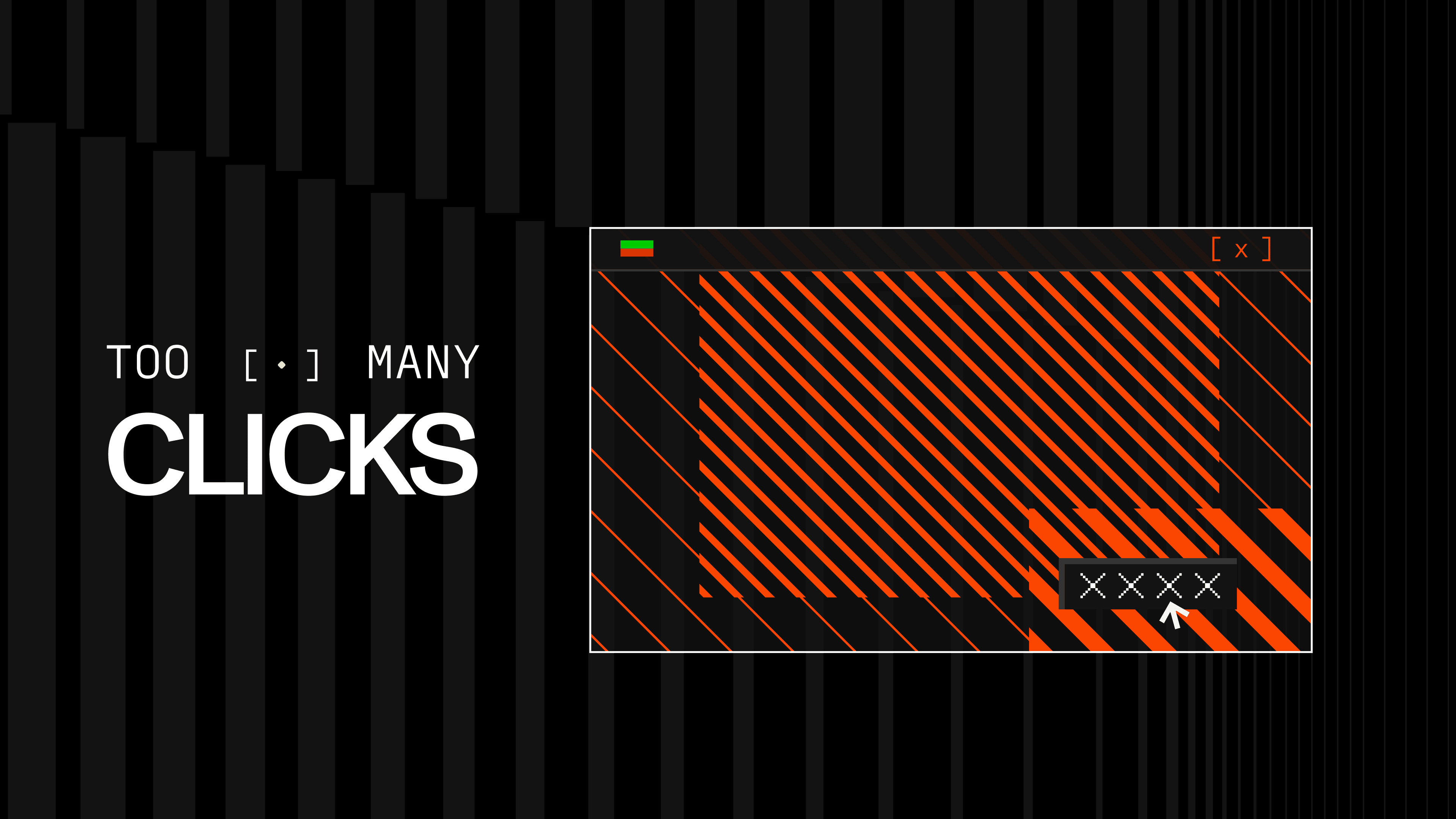 STY-3
STY-3 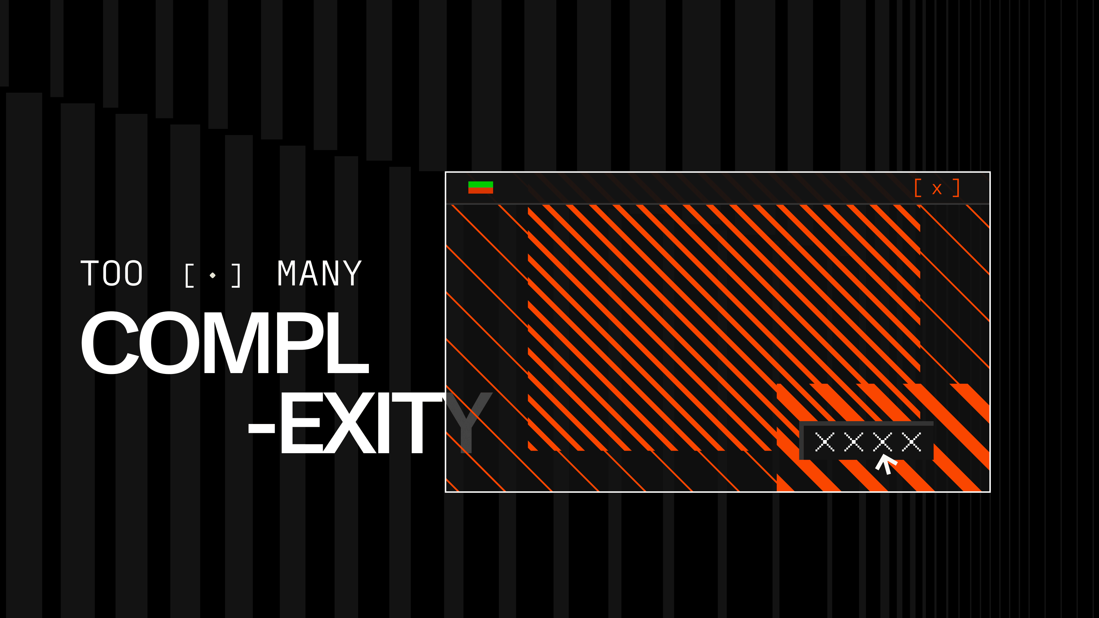 STY-4
STY-4 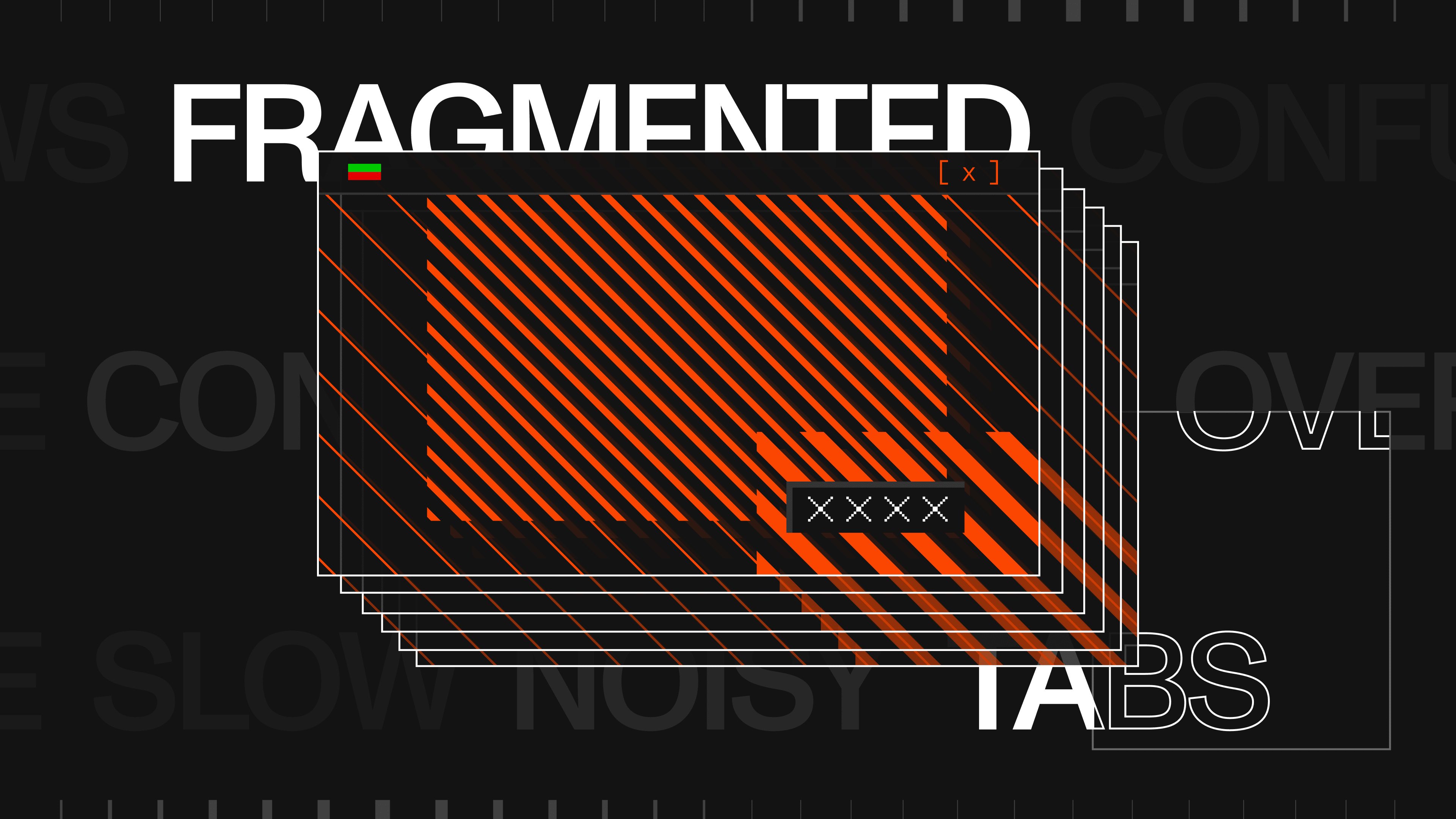 STY-5
STY-5 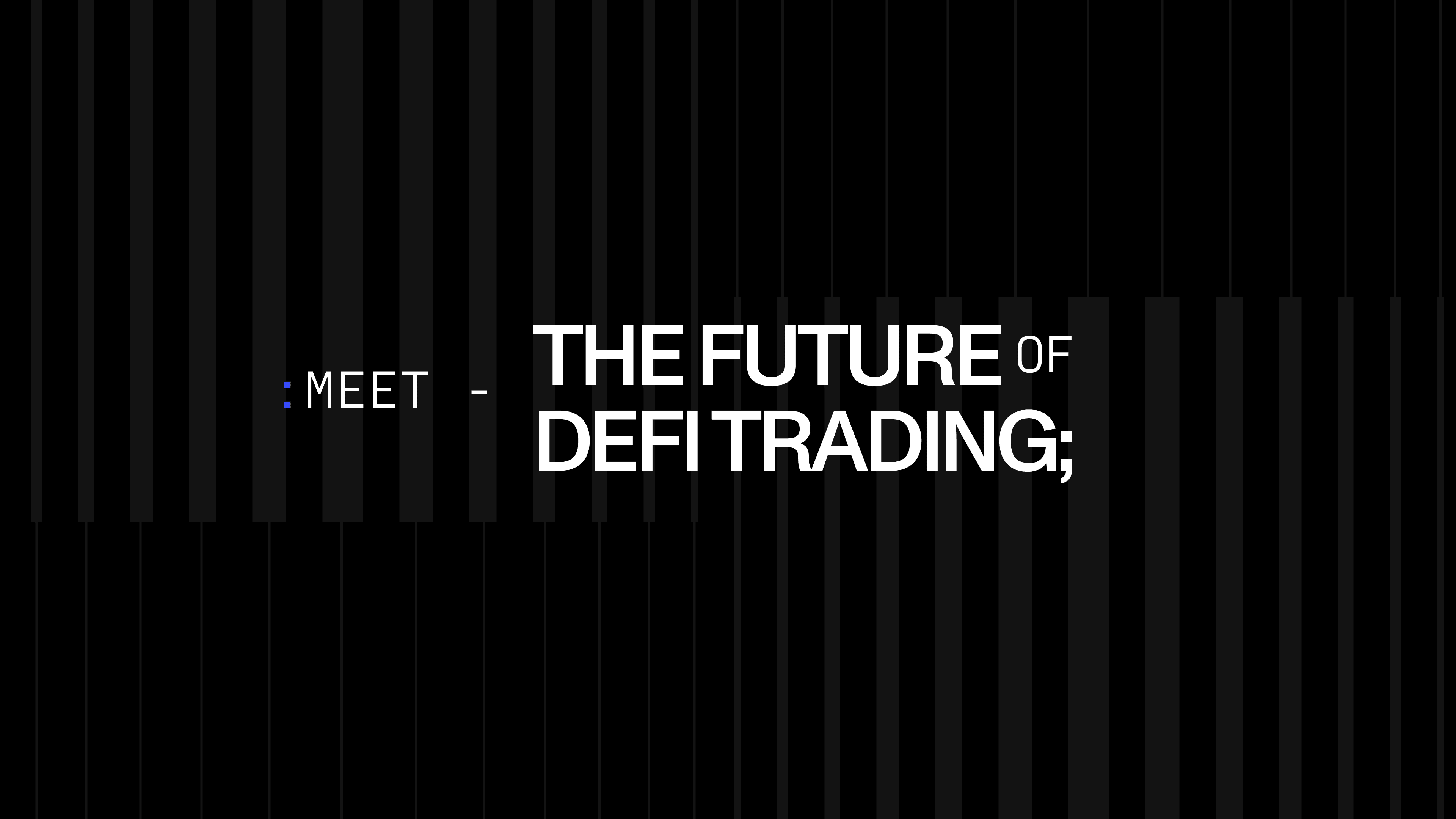 STY-6
STY-6  STY-7
STY-7 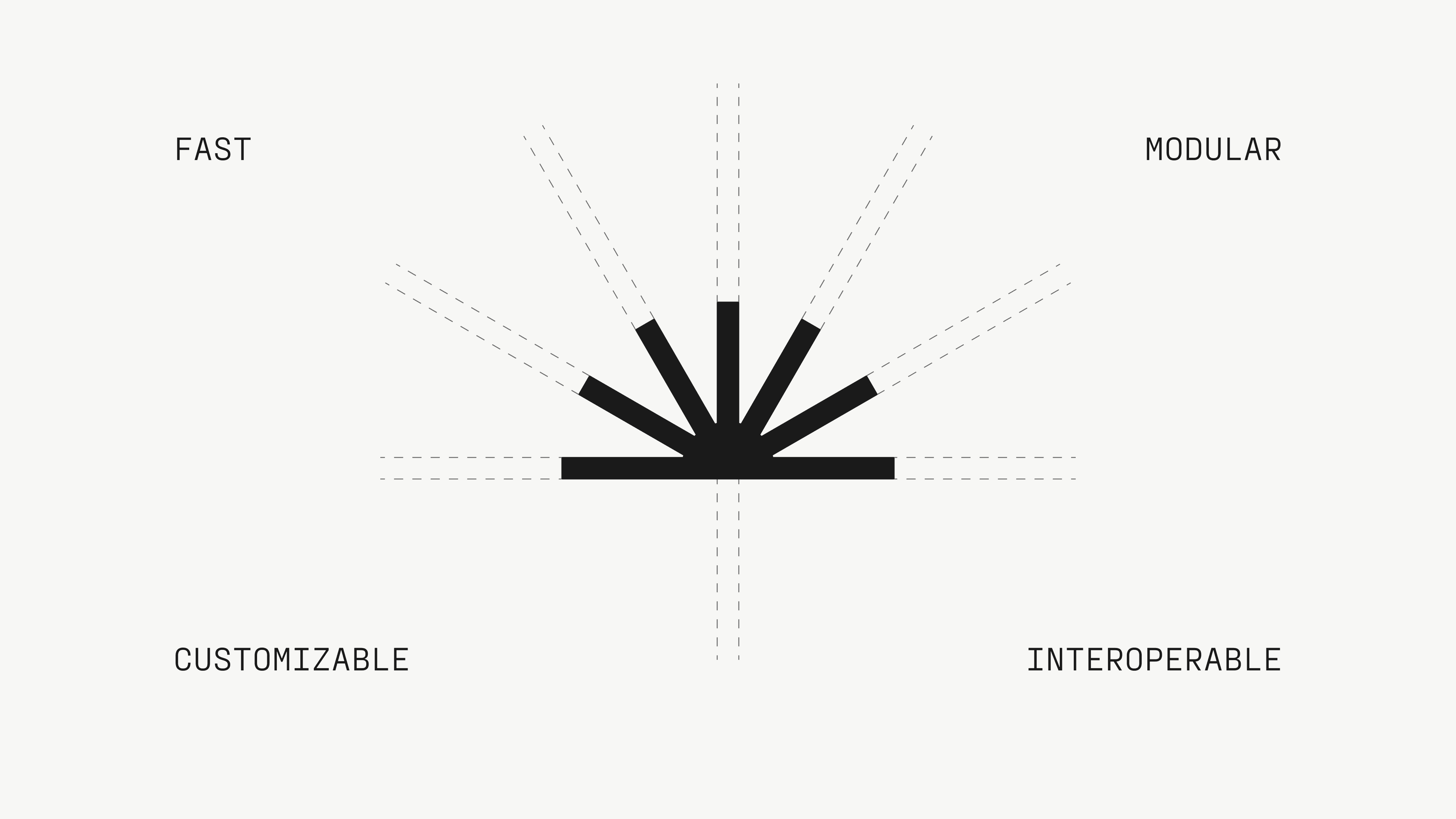 STY-8
STY-8 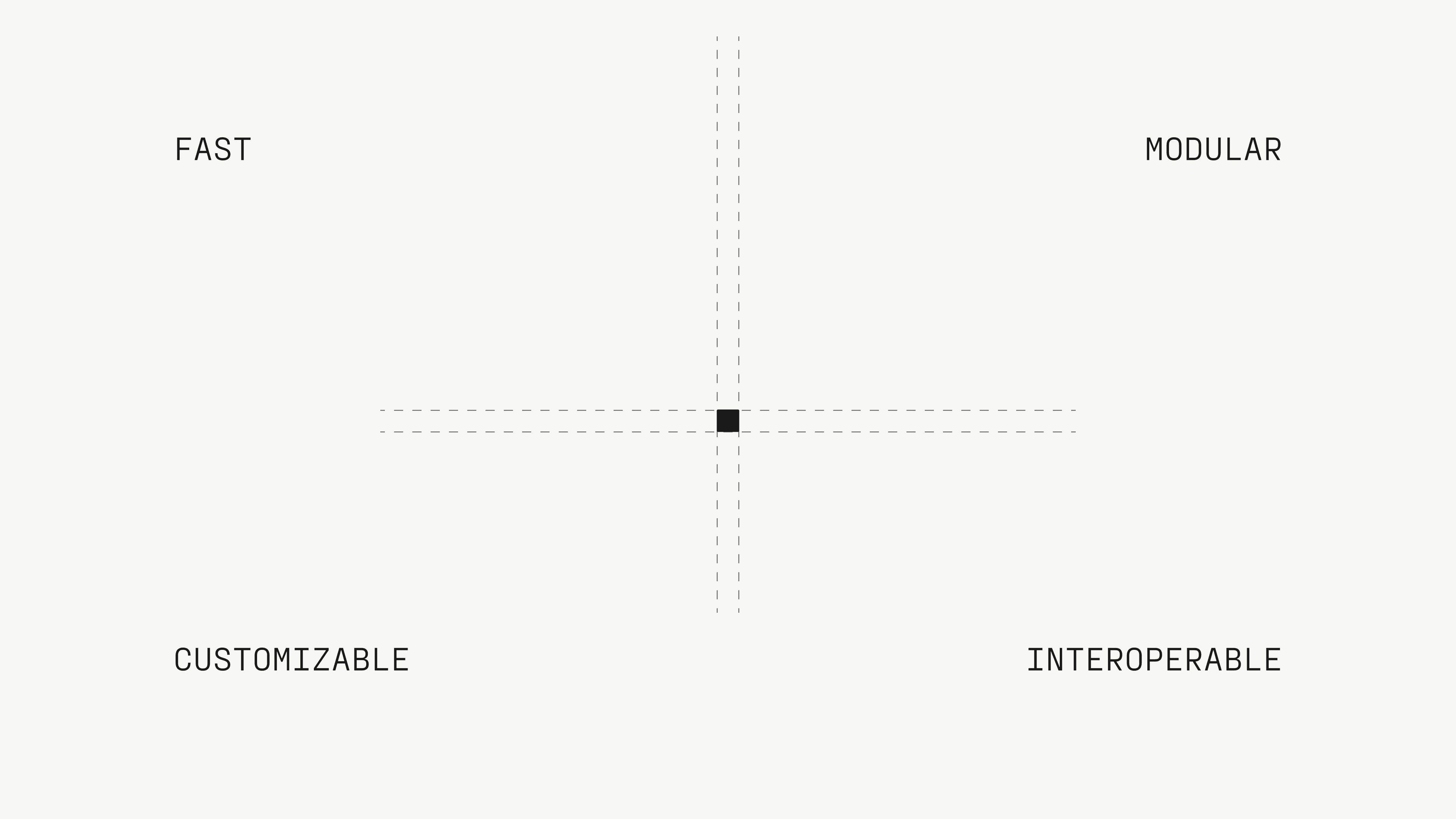 STY-9
STY-9 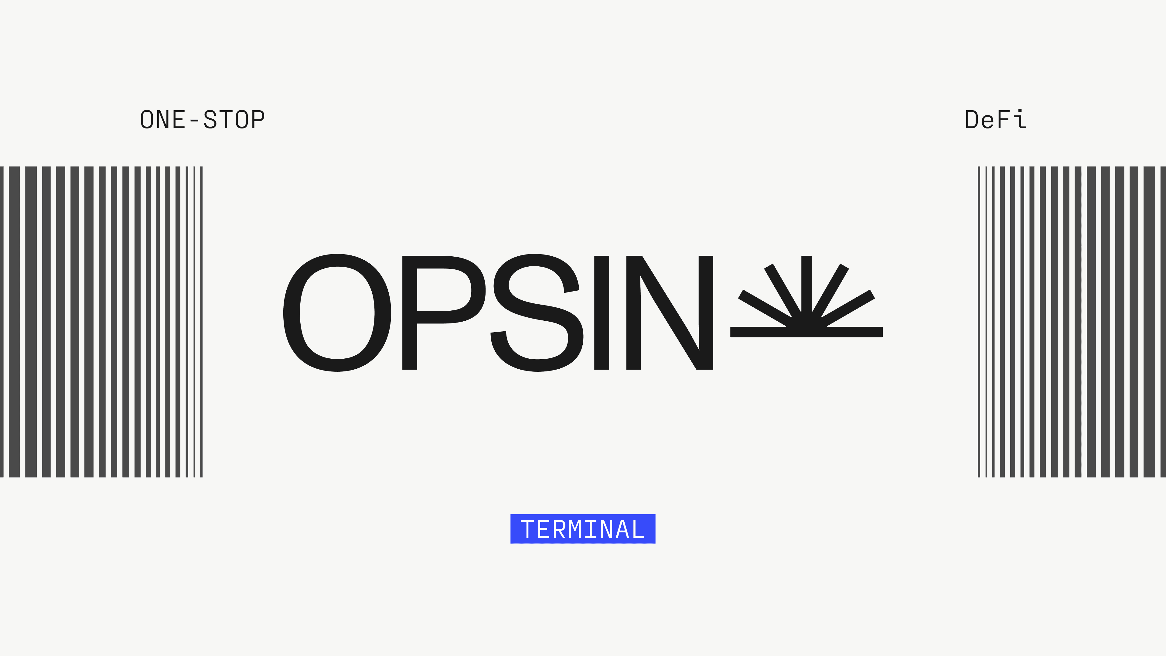 STY-10
 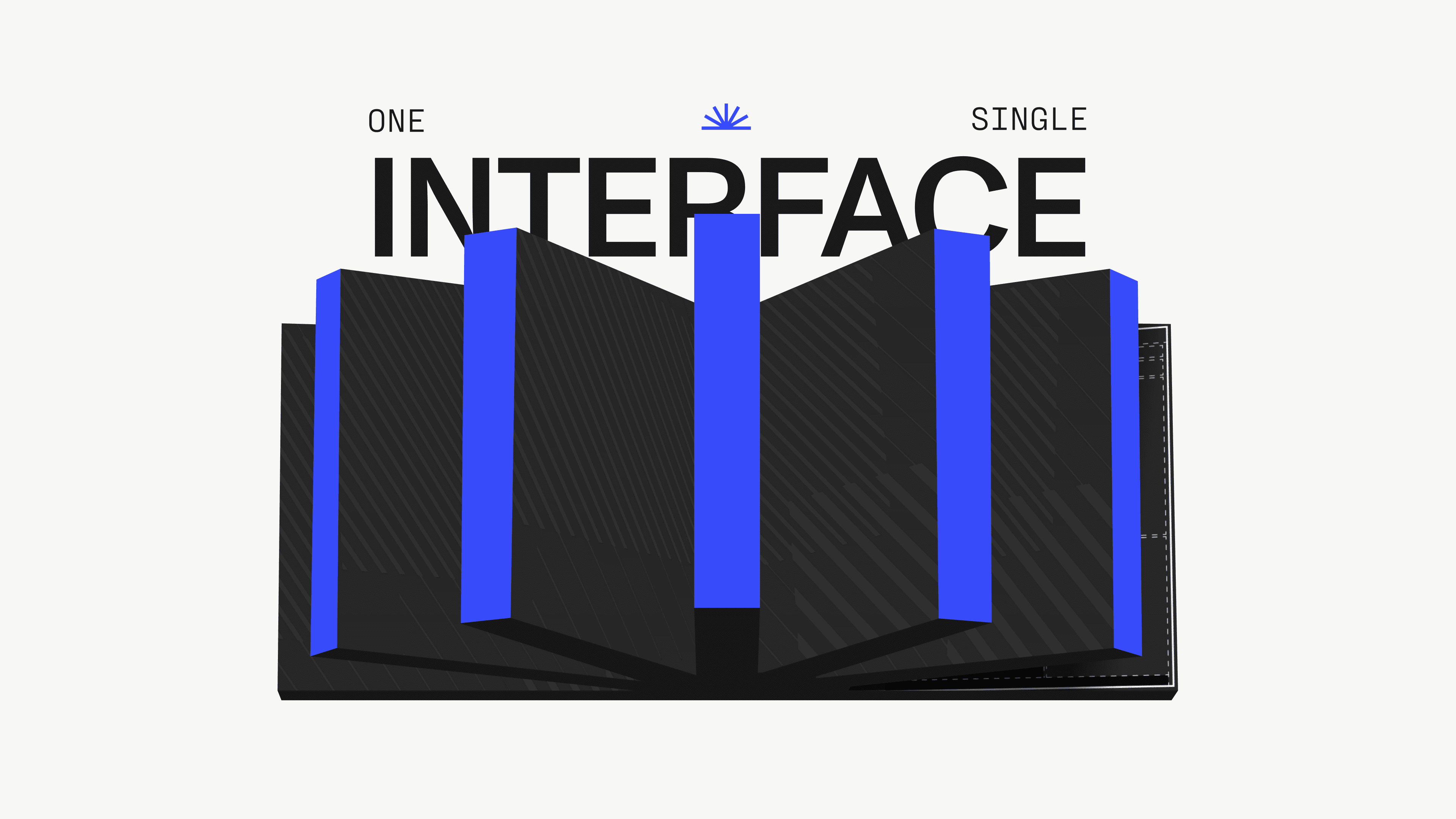 STY-11
 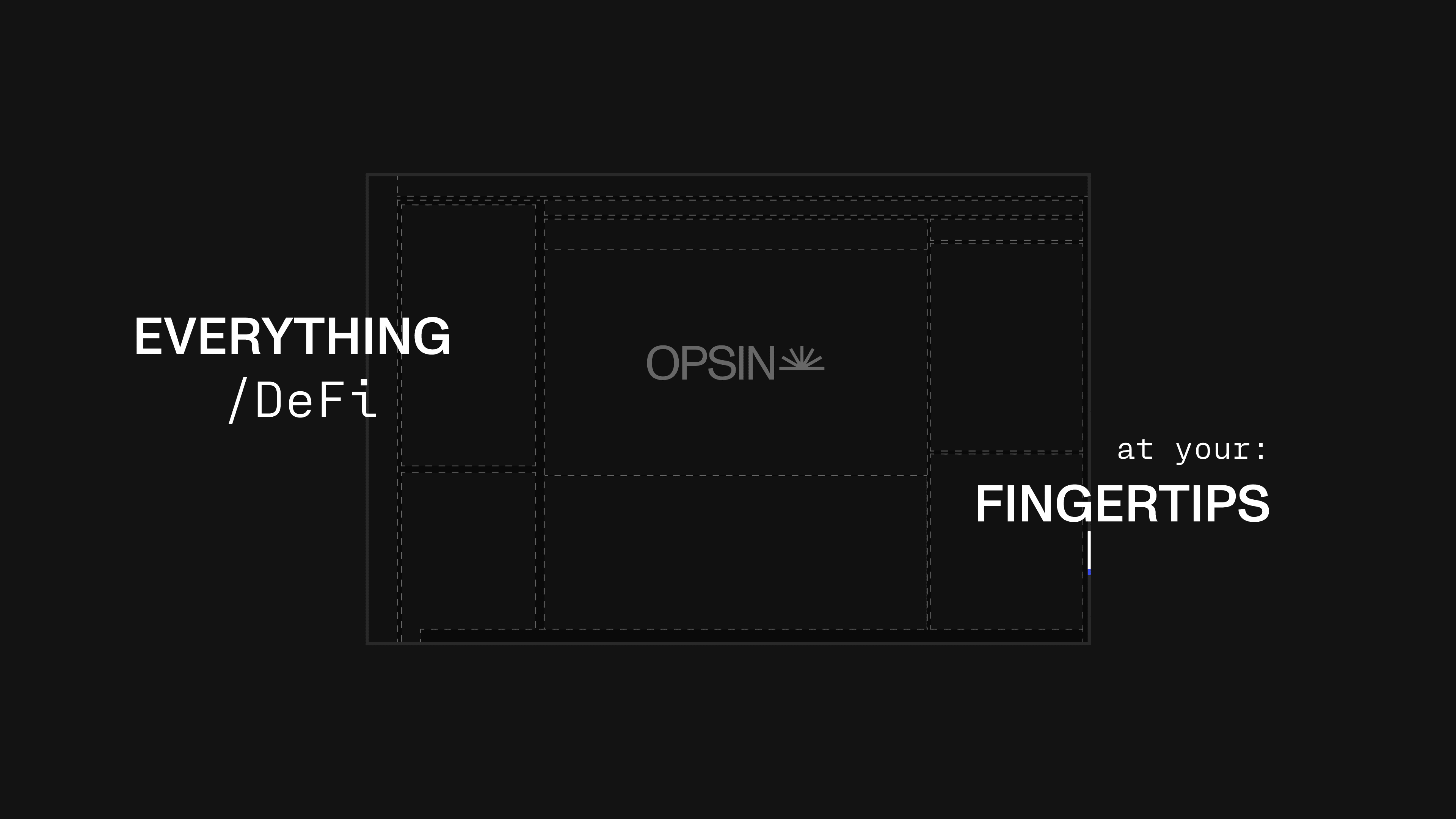 STY-12
 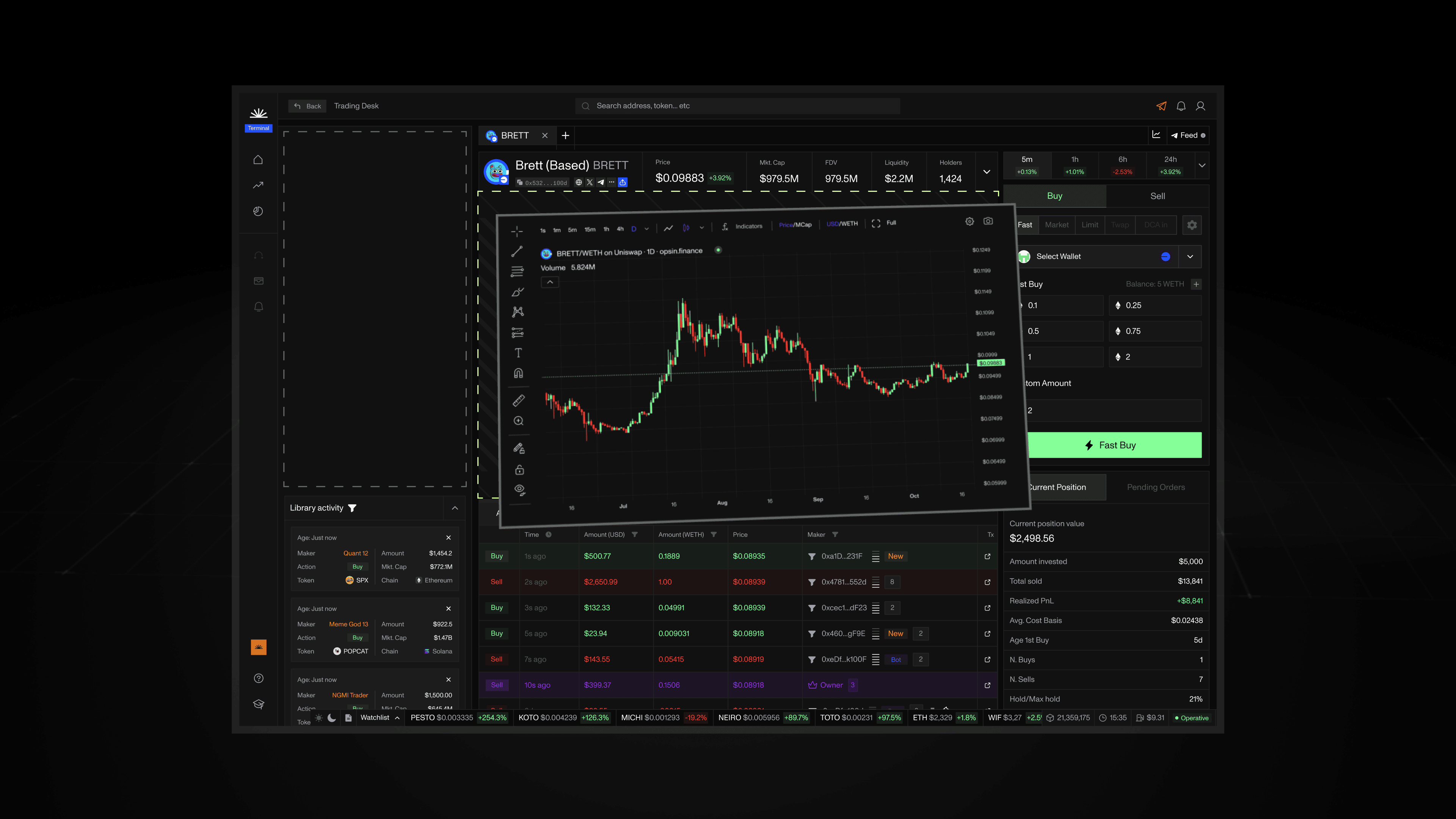 STY-13
 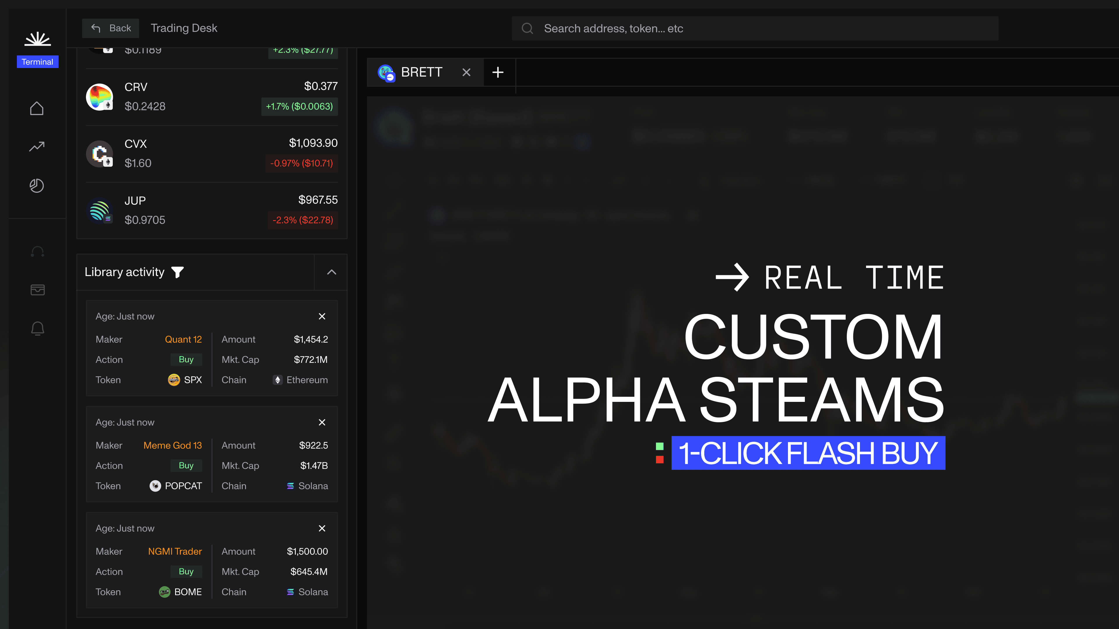 STY-14
  STY-15
  STY-16
 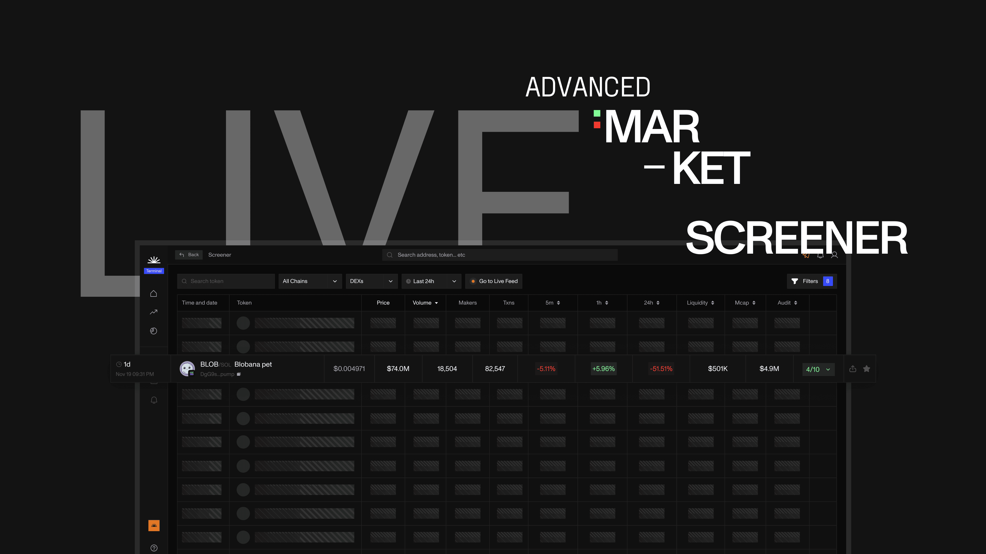 STY-17
 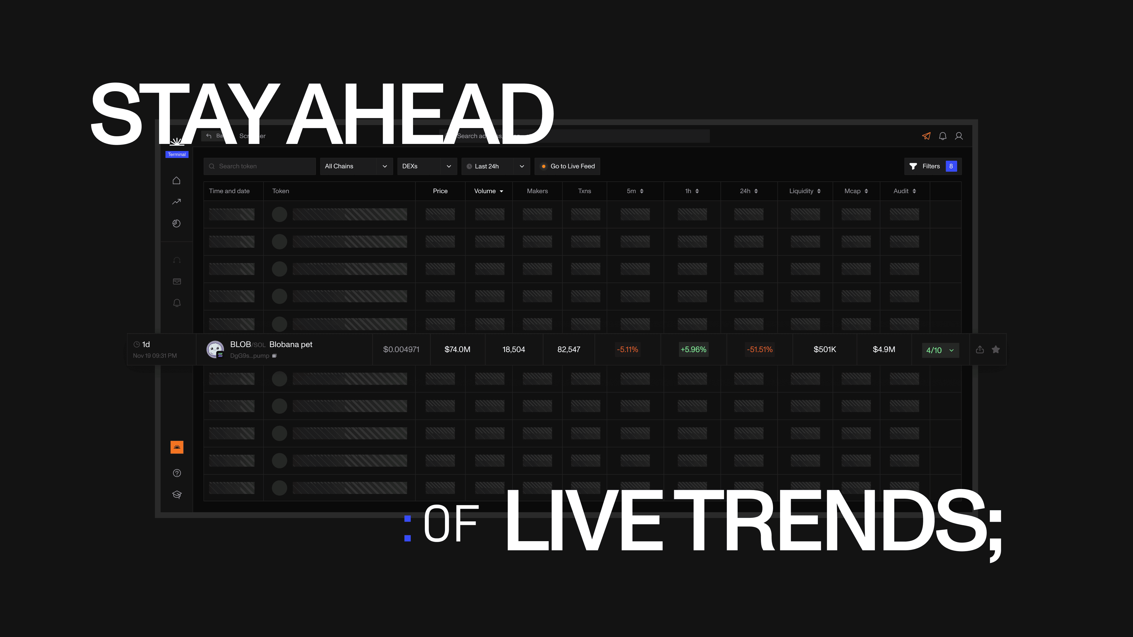 STY-18
 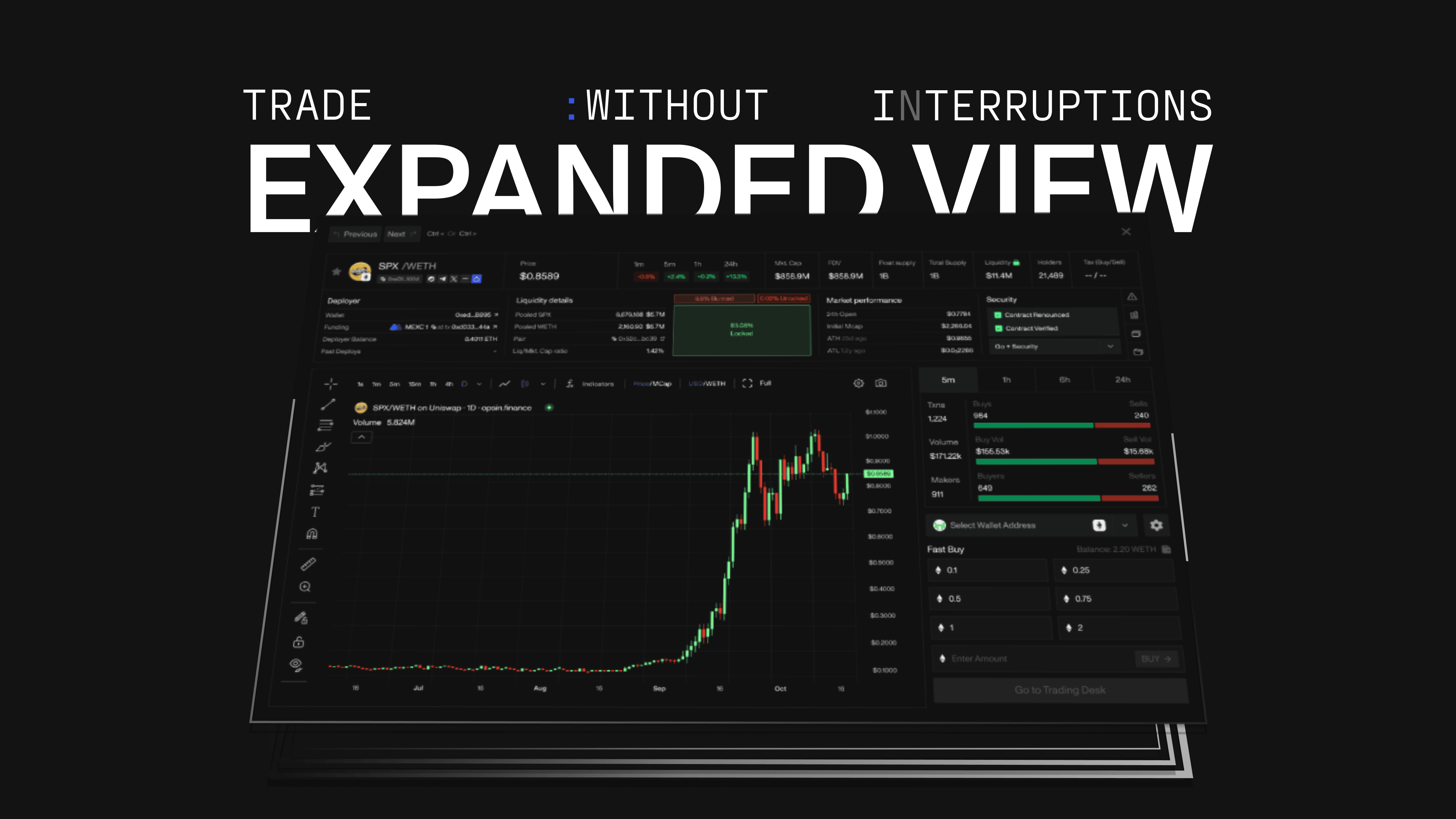 STY-19
 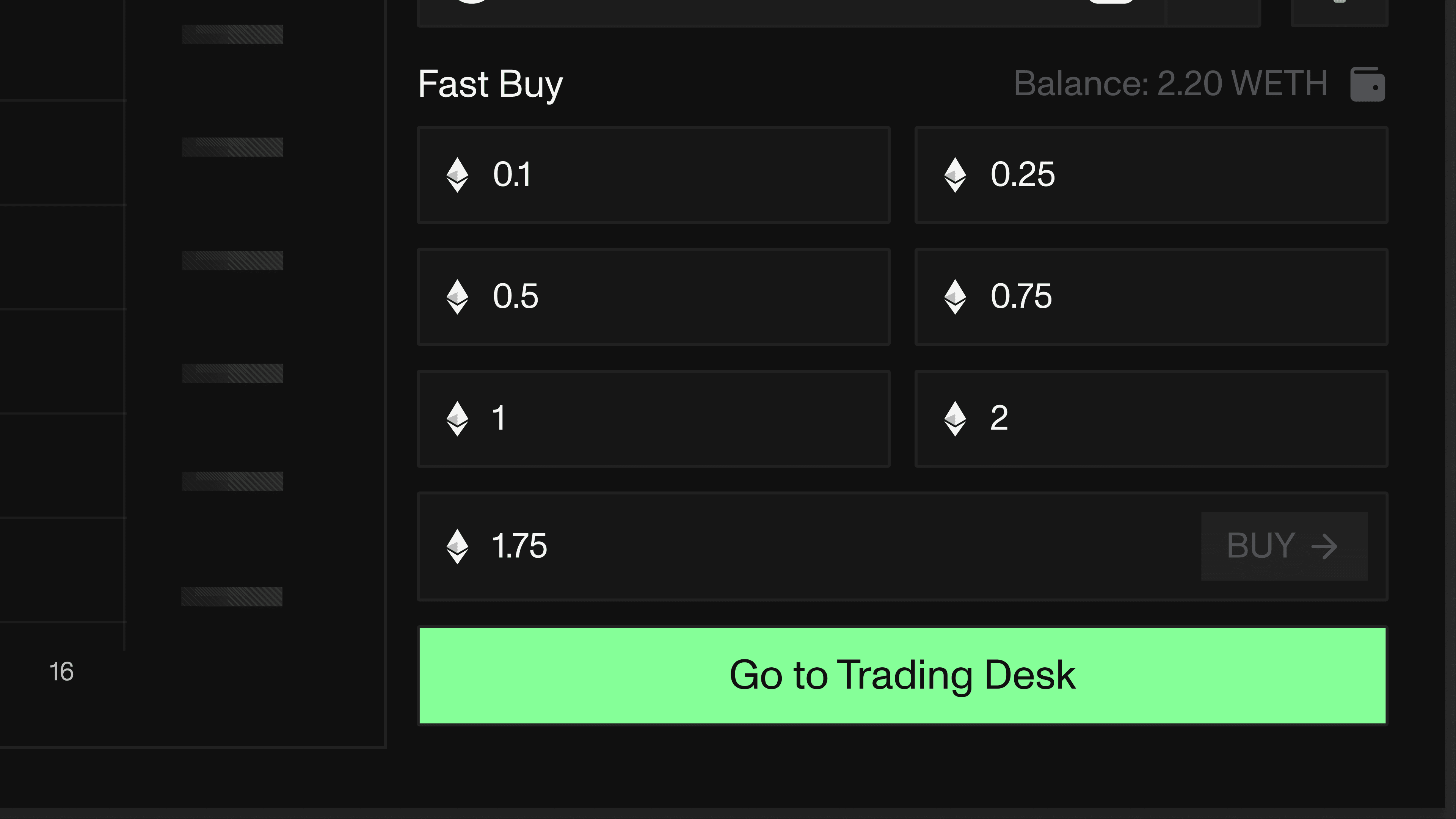 STY-20
 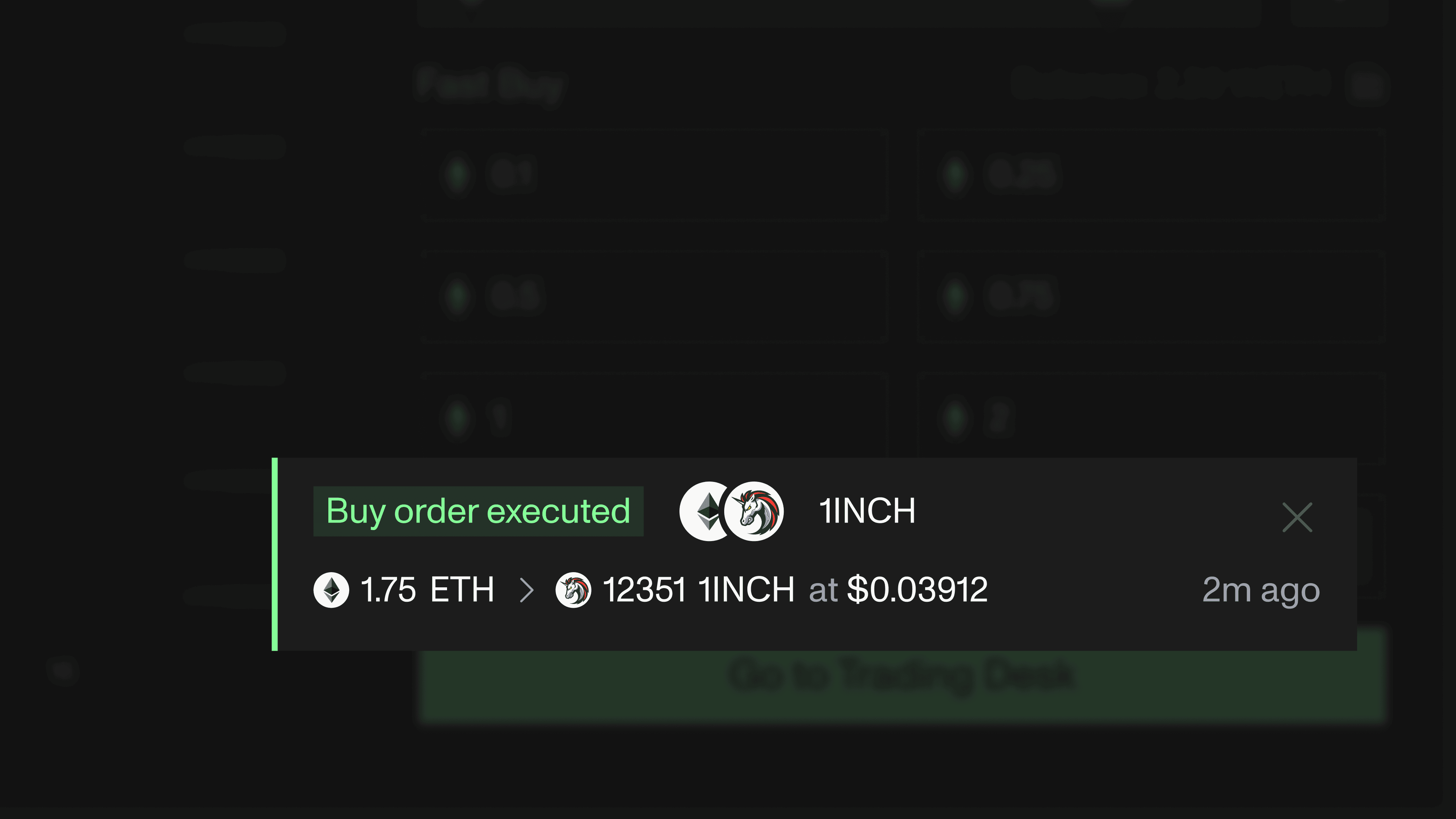 STY-21
 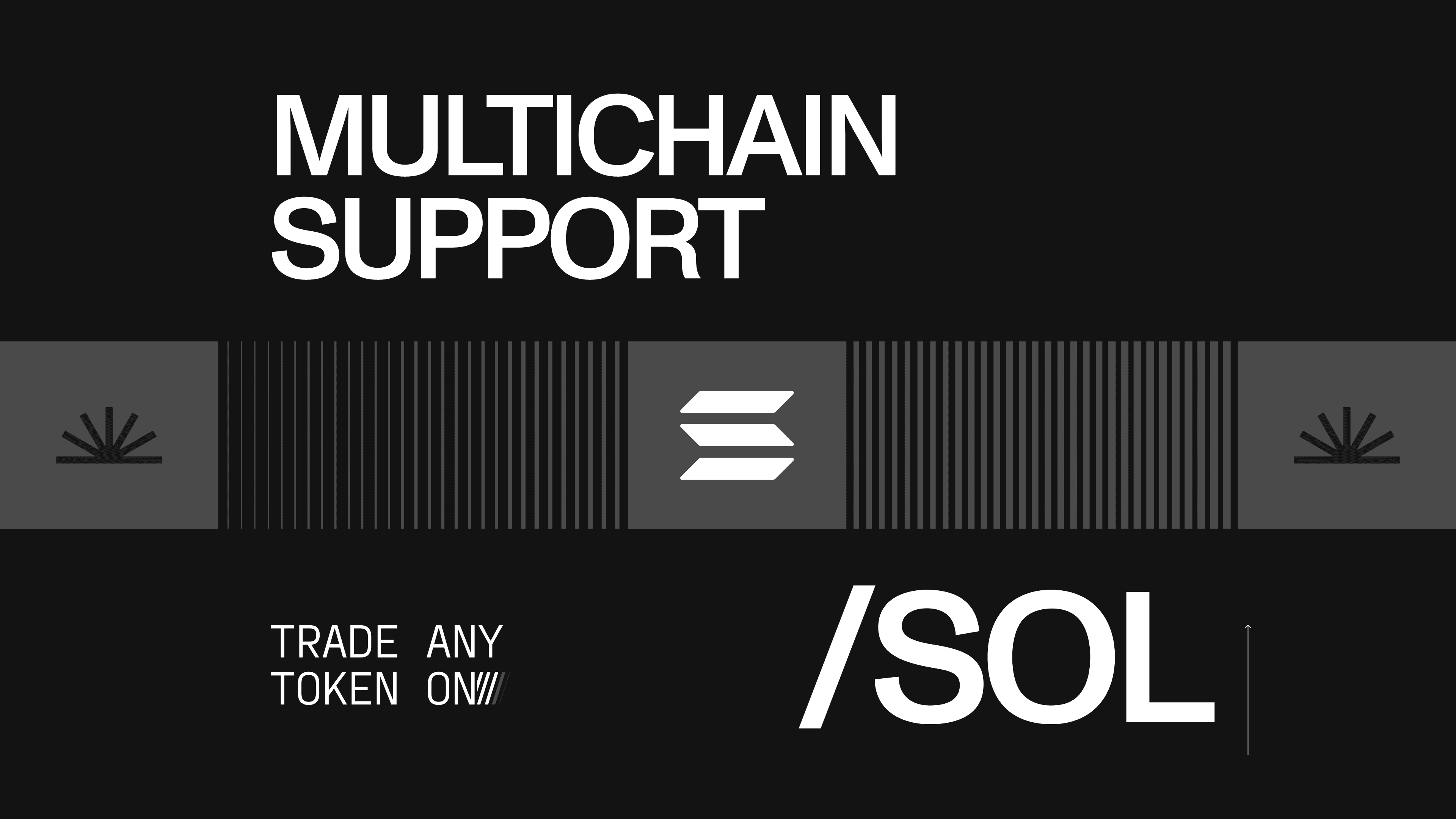 STY-22
 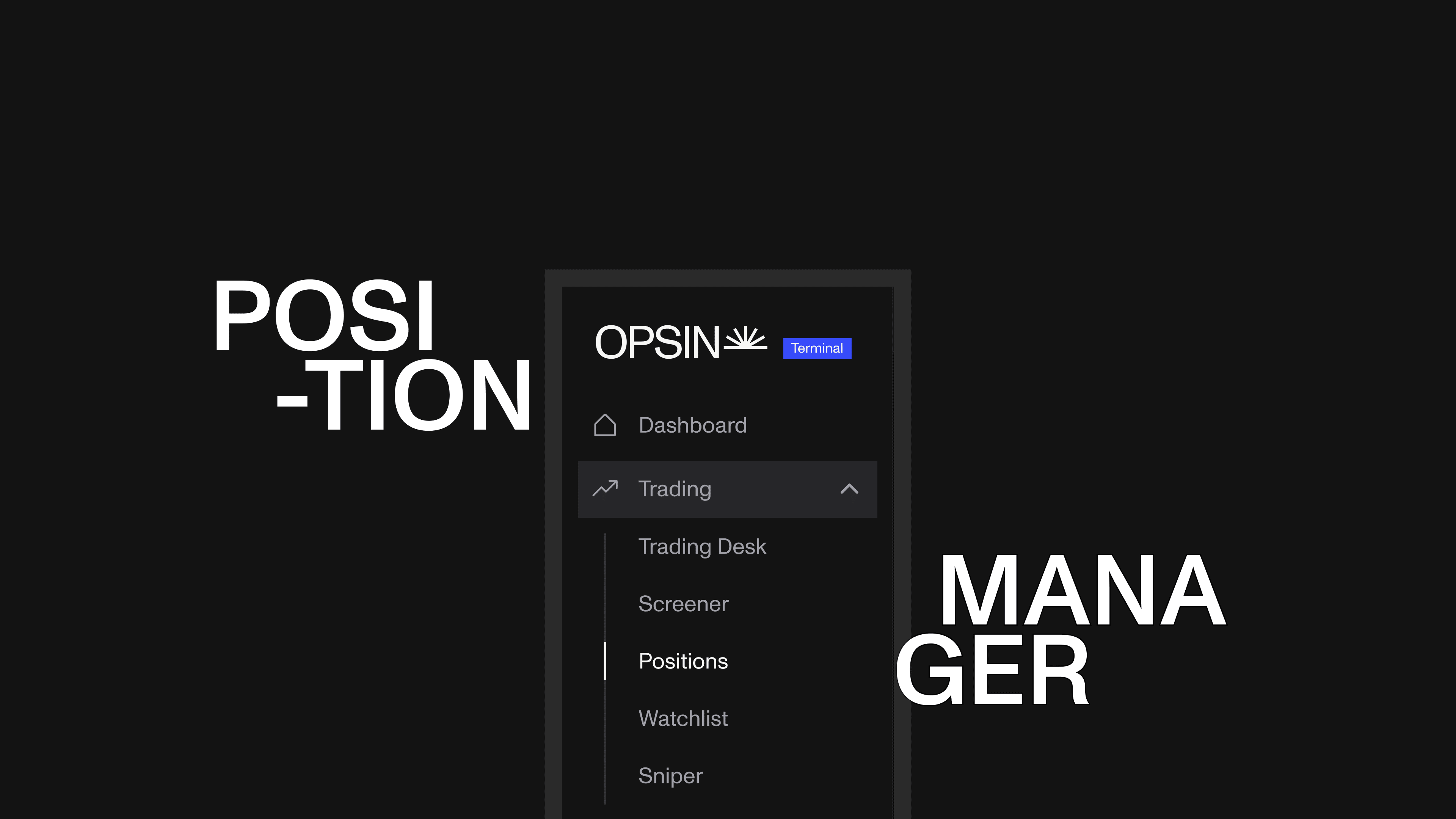 STY-23
 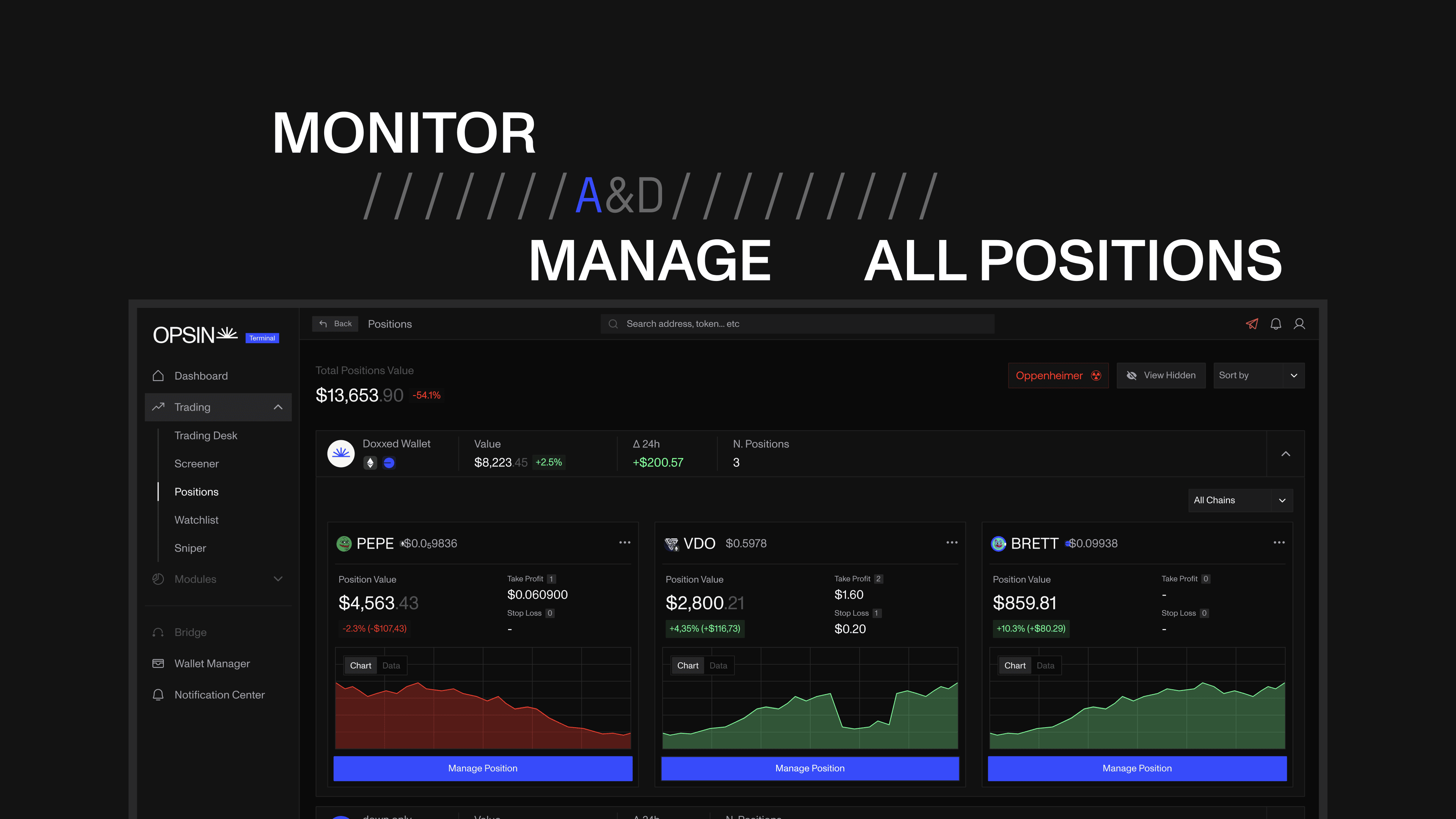 STY-24
 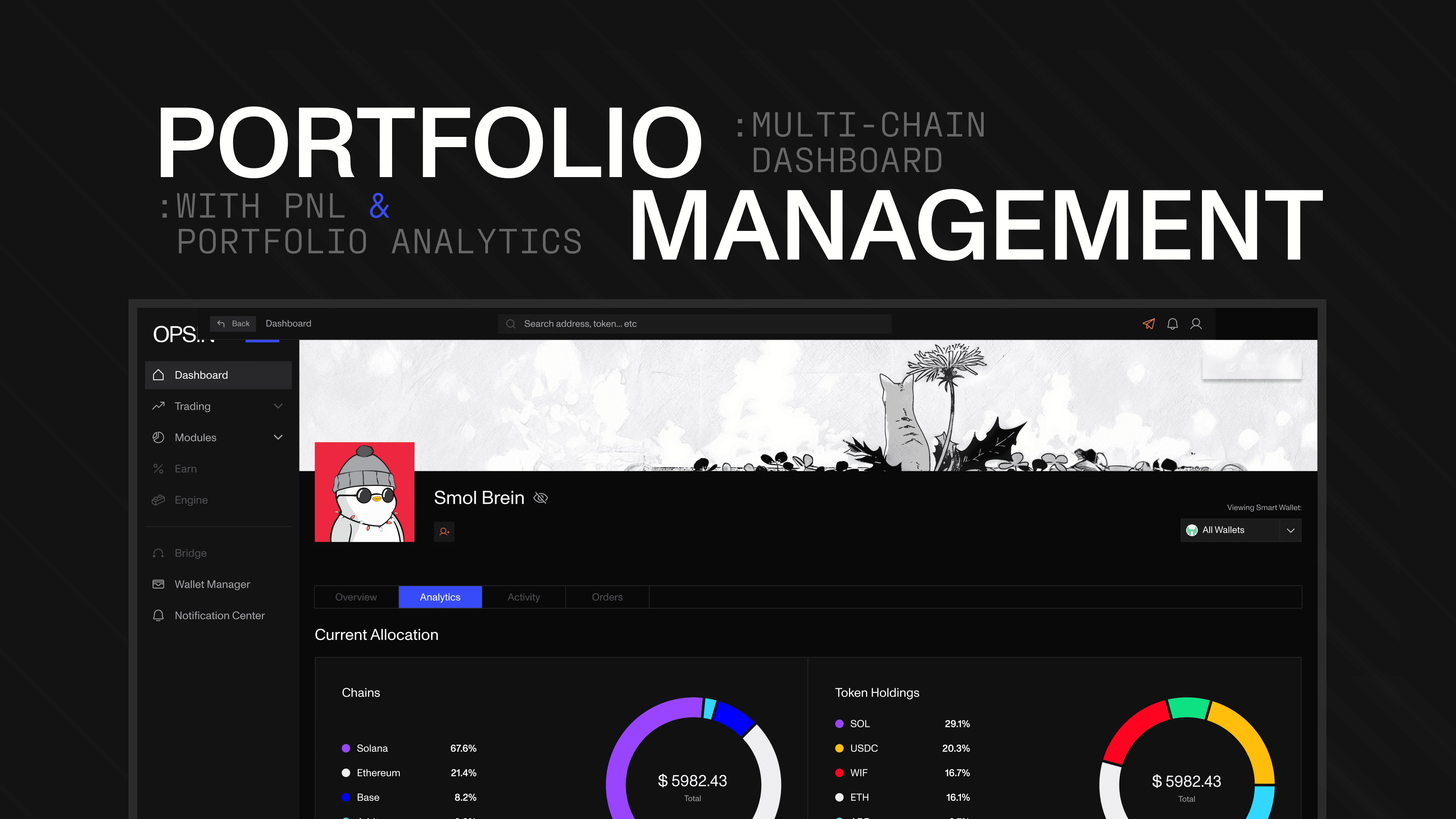 STY-25
 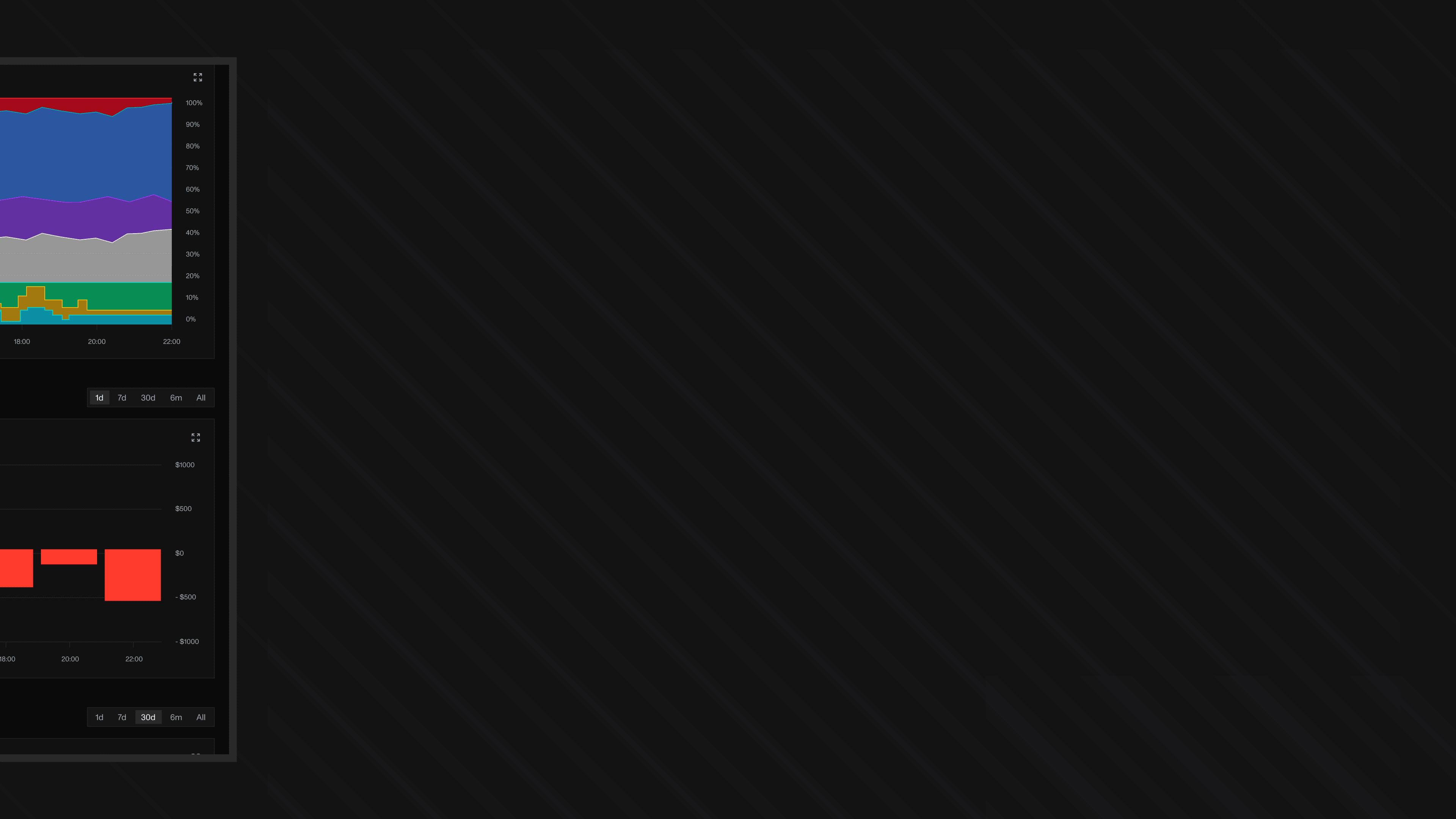 STY-26
  STY-27